VISUALIZING THE BRAZILIAN DIASPORA IN THE U.S.A.
This project was developed in partnership with Boston University’s Spark Lab. The Spark Lab is a technology incubator and experimental learning lab for student-led computational and data driven projects at Boston University.
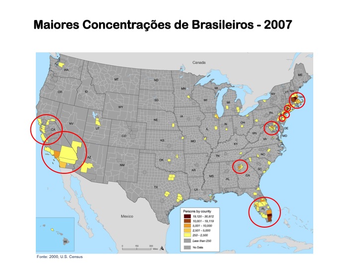
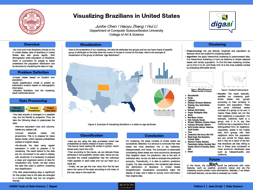
As part of the CS 506 class, students Junhe Chen, Haoyu Zhang, and Hui Li, under the supervision of Dharmesh Tarapore and Alvaro Lima, developed a platform to visualize the Brazilian population in the United States utilizing U.S. Census data.
The Spark team analyzed the different attributes in the data set of the U.S. Bureau of Census for the distribution of Brazilians in different states and tried to extract the best representative tags or features about Brazilians in an area. The tags were normalized and vectorized in order to perform a hierarchical clustering algorithm so that users could zoom in on the map to show more detailed information in the corresponding region.
A primary goal of the data visualization was to communicate information clearly and efficiently via statistical graphics, plots, and information graphics. Numerical data was encoded using dots, lines, or bars, to communicate a quantitative message visually. Effective visualization helps users analyze and reason about data and evidence. It makes complex data more accessible, understandable, and useable.
Besides the data from the U.S. Census Bureau, the project also uses data from Ministério das Relações Exteriores do Brasil (MRE). Because MRE provides only a count of Brazilians in the U.S., we used the U.S. Census distribution of Brazilians by State and applied this distribution to the total population provided by the MRE.
To access the visualization click here: VISUALIZING THE BRAZILIAN DIASPORA.
The project proposal can be accessed here: CS_506_Proposal.
A final poster is available here: CS_506_Final_Poster.
A complete description of the project and its methodology can be founded here: CS_506_Final_Report.
|
Users may have particular analytical tasks, such as making comparisons or understanding causality and the design principle of the graphic followed these tasks. Tables were generally designed so that users can look up a specific measurement. In contrast, charts of various types show patterns or relationships in the data for one or more variables. |
 |
The front end of the visualization was designed so that the data could be displayed on a map and plotted on charts so that attributes could then be shown as the user moves the cursor of the mouse onto the area of a state in the browser or click on a attribute on the charts so that this attribute is displayed on the map.
The project was sponsored by Digaai, today, the Instituto Diaspora Brasil (IDB).
Brasileiros na América do Sul
BRASILEIROS NA AMÉRICA DO SUL "Lorem ipsum dolor sit amet, consectetur adipiscing elit, sed do eiusmod tempor incididunt ut labore et dolore magna aliqua. Ut enim ad minim veniam, quis nostrud exercitation ullamco laboris nisi ut aliquip ex ea commodo consequat. Duis...
Brasileiros no Chile
Segundo o Ministério das Relações Exteriores cerca de 10.600 brasileiros viviam no Chile em 2010. A base de dados do IMILA (Investigação de Migração Internacional da América Latina) indica que …
Brasileiros nos Estados Unidos: Meio Século (Re)fazendo a América (1960 – 2010)
Lançamento do Livro: Brasileiros nos Estados Unidos: Meio Século (Re)fazendo a América (1960 – 2010).Brasileiros nos Estados Unidos - Meio Século (Re)fazendo a América apresenta análises, até então não publicadas, além de organização de dados produzidos ao...
Nenhum resultado encontrado
A página que você solicitou não foi encontrada. Tente refinar sua pesquisa, ou use a navegação acima para localizar a postagem.


