VISUALIZING THE BRAZILIAN DIASPORA IN THE U.S.A.
This project was developed in partnership with Boston University’s Spark Lab. The Spark Lab is a technology incubator and experimental learning lab for student-led computational and data driven projects at Boston University.
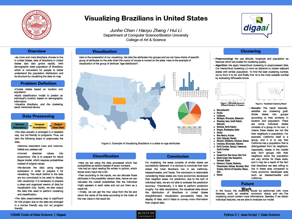
As part of the CS 506 class, students Junhe Chen, Haoyu Zhang, and Hui Li, under the supervision of Dharmesh Tarapore and Alvaro Lima, developed a platform to visualize the Brazilian population in the United States utilizing U.S. Census data.
The Spark team analyzed the different attributes in the data set of the U.S. Bureau of Census for the distribution of Brazilians in different states and tried to extract the best representative tags or features about Brazilians in an area. The tags were normalized and vectorized in order to perform a hierarchical clustering algorithm so that users could zoom in on the map to show more detailed information in the corresponding region.
A primary goal of the data visualization was to communicate information clearly and efficiently via statistical graphics, plots, and information graphics. Numerical data was encoded using dots, lines, or bars, to communicate a quantitative message visually. Effective visualization helps users analyze and reason about data and evidence. It makes complex data more accessible, understandable, and useable.
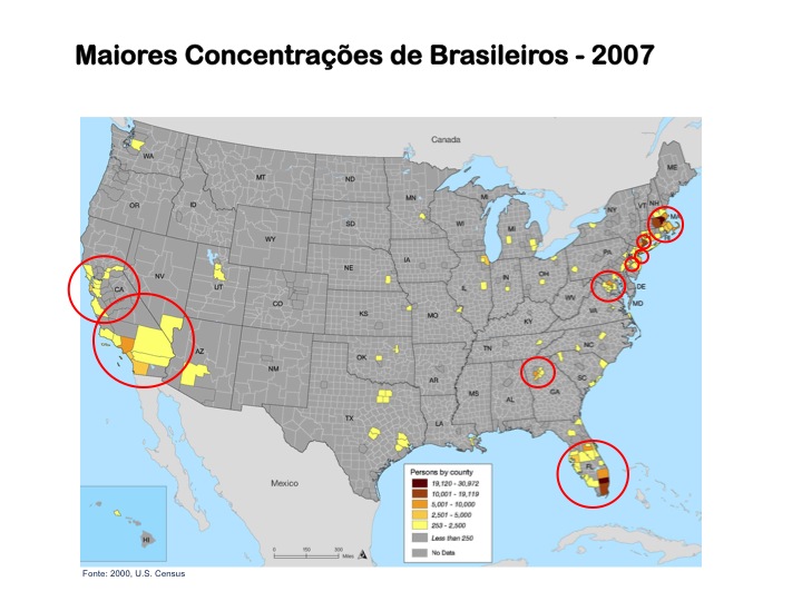
Besides the data from the U.S. Census Bureau, the project also uses data from Ministério das Relações Exteriores do Brasil (MRE). Because MRE provides only a count of Brazilians in the U.S., we used the U.S. Census distribution of Brazilians by State and applied this distribution to the total population provided by the MRE.
To access the visualization click here: VISUALIZING THE BRAZILIAN DIASPORA.
The project proposal can be accessed here: CS_506_Proposal.
A final poster is available here: CS_506_Final_Poster.
A complete description of the project and its methodology can be founded here: CS_506_Final_Report.
|
Users may have particular analytical tasks, such as making comparisons or understanding causality and the design principle of the graphic followed these tasks. Tables were generally designed so that users can look up a specific measurement. In contrast, charts of various types show patterns or relationships in the data for one or more variables. |
 |
The front end of the visualization was designed so that the data could be displayed on a map and plotted on charts so that attributes could then be shown as the user moves the cursor of the mouse onto the area of a state in the browser or click on a attribute on the charts so that this attribute is displayed on the map.
The project was sponsored by Digaai, today, the Instituto Diaspora Brasil (IDB).
Brasileiros nos Estados Unidos
A imigração brasileira para os Estados Unidos é parte da longa história dos processos migratórios para este país. O fluxo migratório brasileiro para os Estados unidos é o principal fluxo de saída do Brasil e formou-se de início, com a saída de brasileiros da região sudeste do brasil…
Brasileiros no Oriente Médio
As populações de brasileiros no Oriente Médio são bastante pequenas e concentradas em poucos países. Israel, com 20.000 brasileiros e o Líbano com 5.000 representam respectivamente (62,7%) e (15,7%) da população brasileira do Oriente Médio. …
Brasileiros na Argentina
A migração brasileira para a Argentina tem por um lado um caráter rural, direcionado principalmente para a província de Missiones e constituído majoritariamente por trabalhadores e pequenos proprietários agrícolas, e por outro, um caráter urbano, voltado para a Região Metropolitana de Buenos Aires composta …
Brasileiros na Espanha
Entre a segunda metade do século XIX e começo do século XX, houve uma grande emigração de espanhóis para a América Latina sendo o Brasil o terceiro país de maior destino destes. Este processo se inverte na década de 80 com o Brasil enviando um número crescente de seus cidadãos pra aquele país.
Brasileiros no Paraguai
A grande migração brasileira de “fronteira agrícola,” para o Paraguai está ligada aos incentivos oferecidos pelo governo daquele país seguindo a sua política de desenvolvimento agrícola durante o governo Stroessner (1954-1989). Estas políticas incluíram a criação de mecanismos de atração via a outorga de extensas …
Transnacionalismo
Imigração Transnacional Hoje, a tecnologia, economia, demografia, política, e fatores culturais têm acelerado de forma crescente a imigração transnacional. Os imigrantes transnacionais, envolvem-se em atividades além-fronteiras, e através destas constroem “campos...
Neoliberalismo e Trabalho Imigrante
Neoliberalismo e Trabalho ImigranteSérie de seis seminários sobre Neoliberalismo e o Trabalho Imigrante terá aula bônus disponível a partir do dia 17/01. As inscrições estão abertas até o dia 20 de janeiro. Quem se inscrever após o dia 17 terá acesso ao conteúdo...
Eleições Presidenciais Brasileiras no Exterior (1989 – 2022)
A participação dos emigrantes no processo político dos seus países de origem, seja pelo exercício do voto ou pela capacidade de concorrer a cargos eletivos, é expressão do aumento significativo da migração internacional e das crescentes atividades transnacionais destes emigrantes.
O livro Ausente & Presente: O Voto…